Original Link: https://www.behance.net/gallery/64679049/Nike-Air-Max-Day-2018-(Buenos-Aires)-Posters
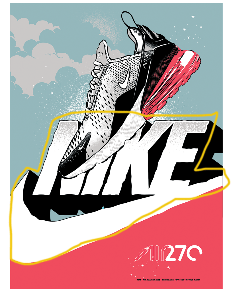
This ad was created by George Manta and was designed to be used in Buenos Aires, Argentina.

Alignment
It’s interesting that the letters in “Nike” are italicized and curved throughout but are still aligned perfectly when you draw straight lines on the top and bottom of them. The most notable parts of this image (the shoe, swoosh) are a little off kilter but the aligned Nike letters act as a good anchor to keep the image from appearing too chaotic.

Contrast
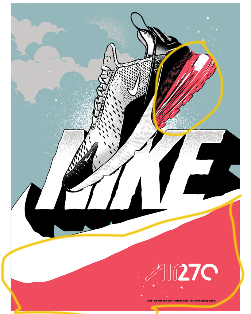
The centerpiece of the image is obviously the shoe that they are marketing. The designer chose to accentuate the bottom heel of the shoe due to that being the most famous and most distinguishing feature of the brand that is Nike Air. By keeping the rest of the shoe grayscale, the designer is drawing our attention to the most fashionable part of the shoe.

Repetition
The repeating stardust in this design is definitely noteworthy. It gives us an idea of cleanliness and brightness due to the many stars used. The stars seem to be emanating from the word “Air” which again draws our attention the most famous and vintage part of the Nike brand. Nike was the first company to put air in a shoe and that added to their brand tremendously. The designer is using the brand credibility to attract us to the ad and the repetition of the stars accomplishes that goal quite effectively.
Proximity
There are various uses of proximity in the design but personally I distinctly noticed the one in the middle above the others. This logo (the Nike swoosh below the spelled out word “Nike”) was one of the first logos used by Nike. After a while the “swoosh” became all that they needed to trigger brand recognition and the word was dropped. This design is using the proximity of the word and the symbol to trigger a sense of nostalgia and highlight the vintage nature of the Nike Air brand. In our day, older brands are trendy and the designer is using that to sell the shoe. Even though that logo isn’t found anywhere on the shoe, it’s being used in the design for brand recognition.
Color
The use of color in this design is very intentional. The shoe that is being marketed is for casual use and in no way is meant for athletic usage. The feminine dark pink color used here is meant to target the surging market of females wearing athletic looking gear casually. This shoe is not meant for just women but the color suggests that the target market for this kind of shoe is particularly female.
Conclusion
Overall, I thought the designer used the principles of design very well to effectively sell the new Nike Air Max 270. The overall themes that I noticed were the use of color to create focus for the target market and to accentuate the most distinguishable part of the shoe that make it different from other shoes on the market. The other theme that was apparent was the use of the Nike Air brand equity to create a sense of vintage nostalgia for everyone who knows and adores the old Nike Air brand.
