Introduction
This ad was found on the Pakistan Advertisers Society. They are an organization that brings together the advertising community in Pakistan to provide thought leadership in the space. Their idea is that as a group, they can provide the best advertising consulting by working together with the community. It is unknown whether or not this particular ad was designed by this group or by someone else and then embedded on their website.
Original analysis
Contrast
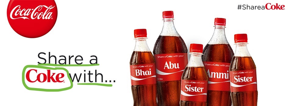
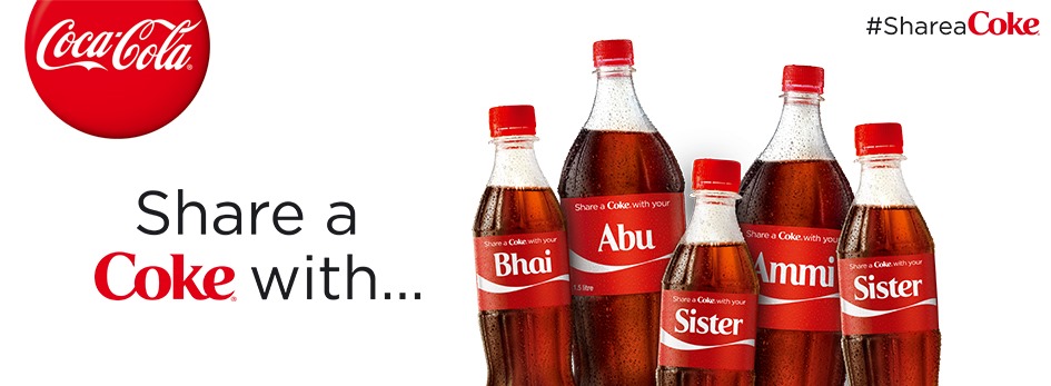
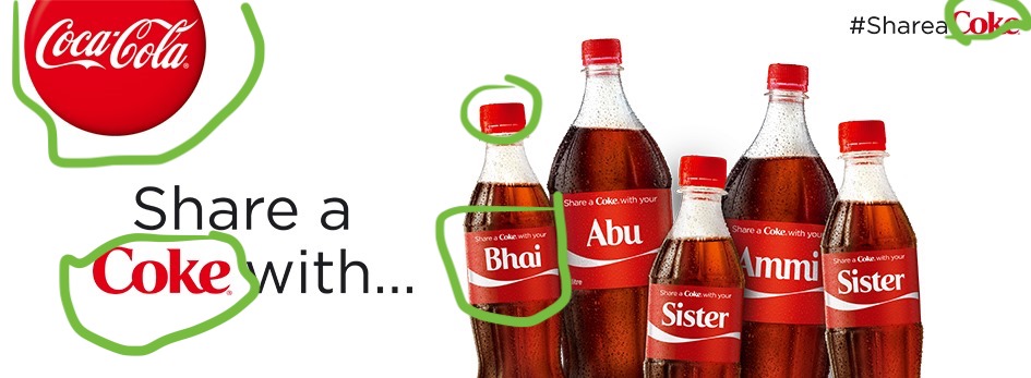
I loved the contrast used by the designer in the color and typography of the “Share a Coke with..” call to action. They used a more dull font and neutral color for the action words and really made the “Coke” pop by using their very recognizable font and color. This is a great example of using brand equity to pull a viewer’s attention to the call to action.
Proximity

The proximity of the bottles gives the viewer a sense of community and family. They are positioned like they would be for a family photo. This helps communicate the purpose of the ad which is to share the goodness of a Coke with loved ones. The bottles are also overlapping so that they look almost as though they are embracing or huddling close together.
Color
I love how Coke kept it simple with the color on this ad. There’s no need to add anything other than the very recognizable Coca-Cola red when your campaign has nothing to do with introducing new flavors. Coke has previously done a campaign where it was introducing new flavors for Diet Coke and used color to create awareness for them. For this campaign, which was intended to give people a sense of community by sharing a Coke the color for the ads needed to stay red so as not to distract the viewer.
Typography

The typography used for this campaign was phenomenal. You can tell that the You2013 font that was created for the names on the bottles was inspired by the Coke logo shown on the left. The letters aren’t cursive but they flow into one another which is perfect for the sense of togetherness that this campaign is going for. It’s also interesting to note that the very old school font used in the top left of the screen remains unchanged and is somewhat contrasting with the other fonts.
Alignment

Instead of using proximity to bring a sense of family to the design, I decided to use alignment similar to how you see bumper stickers of families. To make sure that it was clear I made sure and put “Dad”, “Mom”, etc on the bottle. The bottles are aligned for the reason mentioned above but also different in height to make sure that it’s clear that it’s a family.
Contrast

I used contrast in this design in two ways: color and typography. I really liked how the original design used the difference in font to make the word stand out so I did a similar thing in mine. The difference in my design is that I left the color of the action word black to create a contrast with the Coke red on the page. I tried it with red but I thought it was a little much. The contrast with the black text color and the red and white bottle created a better visual aesthetically in my opinion and made the bottles stand out a bit more.
Color
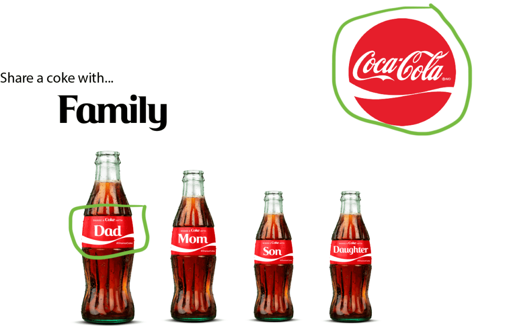
After finishing, I really liked that the only colors that were used were black and red. The intent of the design is to appeal to the viewer’s sense of family and togetherness that would drive them to want to share a Coke with someone with their name on the bottle. Why add more color when the message has nothing to do color. The color that is used is to ensure that viewers recognize the amazing brand that Coke has built.
Typography

The typography used in this design was intended to create contrast. The font for the “Share a Coke with…” text is more bland and unrecognizable to ensure that the Coke branded You2013 font stood out. The natural old school Coca-Cola font used in the logo creates a sense of brand recognition that adds to the credibility of the ad.
Conclusion
The two designs go together due to the similar message that both are portraying. The original is a bit more broad by implying that a Coke can be for anyone. My ad is a bit more specific calling the viewers to share a Coke with their families. The same colors are used and full Coke bottles are representing people in both designs as well. Both designs also have the same call to action that is known in the campaign.
