Be yourself; Everyone else is already taken.
— Oscar Wilde.
This is the first post on my new blog. I’m just getting this new blog going, so stay tuned for more. Subscribe below to get notified when I post new updates.
Be yourself; Everyone else is already taken.
— Oscar Wilde.
This is the first post on my new blog. I’m just getting this new blog going, so stay tuned for more. Subscribe below to get notified when I post new updates.
Introduction
This ad was found on the Pakistan Advertisers Society. They are an organization that brings together the advertising community in Pakistan to provide thought leadership in the space. Their idea is that as a group, they can provide the best advertising consulting by working together with the community. It is unknown whether or not this particular ad was designed by this group or by someone else and then embedded on their website.
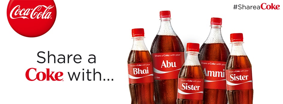
I loved the contrast used by the designer in the color and typography of the “Share a Coke with..” call to action. They used a more dull font and neutral color for the action words and really made the “Coke” pop by using their very recognizable font and color. This is a great example of using brand equity to pull a viewer’s attention to the call to action.

The proximity of the bottles gives the viewer a sense of community and family. They are positioned like they would be for a family photo. This helps communicate the purpose of the ad which is to share the goodness of a Coke with loved ones. The bottles are also overlapping so that they look almost as though they are embracing or huddling close together.
I love how Coke kept it simple with the color on this ad. There’s no need to add anything other than the very recognizable Coca-Cola red when your campaign has nothing to do with introducing new flavors. Coke has previously done a campaign where it was introducing new flavors for Diet Coke and used color to create awareness for them. For this campaign, which was intended to give people a sense of community by sharing a Coke the color for the ads needed to stay red so as not to distract the viewer.

The typography used for this campaign was phenomenal. You can tell that the You2013 font that was created for the names on the bottles was inspired by the Coke logo shown on the left. The letters aren’t cursive but they flow into one another which is perfect for the sense of togetherness that this campaign is going for. It’s also interesting to note that the very old school font used in the top left of the screen remains unchanged and is somewhat contrasting with the other fonts.

Instead of using proximity to bring a sense of family to the design, I decided to use alignment similar to how you see bumper stickers of families. To make sure that it was clear I made sure and put “Dad”, “Mom”, etc on the bottle. The bottles are aligned for the reason mentioned above but also different in height to make sure that it’s clear that it’s a family.

I used contrast in this design in two ways: color and typography. I really liked how the original design used the difference in font to make the word stand out so I did a similar thing in mine. The difference in my design is that I left the color of the action word black to create a contrast with the Coke red on the page. I tried it with red but I thought it was a little much. The contrast with the black text color and the red and white bottle created a better visual aesthetically in my opinion and made the bottles stand out a bit more.
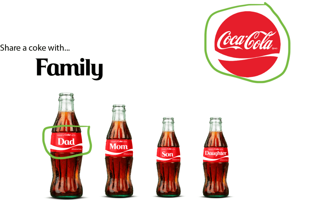
After finishing, I really liked that the only colors that were used were black and red. The intent of the design is to appeal to the viewer’s sense of family and togetherness that would drive them to want to share a Coke with someone with their name on the bottle. Why add more color when the message has nothing to do color. The color that is used is to ensure that viewers recognize the amazing brand that Coke has built.

The typography used in this design was intended to create contrast. The font for the “Share a Coke with…” text is more bland and unrecognizable to ensure that the Coke branded You2013 font stood out. The natural old school Coca-Cola font used in the logo creates a sense of brand recognition that adds to the credibility of the ad.
The two designs go together due to the similar message that both are portraying. The original is a bit more broad by implying that a Coke can be for anyone. My ad is a bit more specific calling the viewers to share a Coke with their families. The same colors are used and full Coke bottles are representing people in both designs as well. Both designs also have the same call to action that is known in the campaign.
Original Link: https://www.behance.net/gallery/64679049/Nike-Air-Max-Day-2018-(Buenos-Aires)-Posters
This ad was created by George Manta and was designed to be used in Buenos Aires, Argentina.

Alignment
It’s interesting that the letters in “Nike” are italicized and curved throughout but are still aligned perfectly when you draw straight lines on the top and bottom of them. The most notable parts of this image (the shoe, swoosh) are a little off kilter but the aligned Nike letters act as a good anchor to keep the image from appearing too chaotic.

The centerpiece of the image is obviously the shoe that they are marketing. The designer chose to accentuate the bottom heel of the shoe due to that being the most famous and most distinguishing feature of the brand that is Nike Air. By keeping the rest of the shoe grayscale, the designer is drawing our attention to the most fashionable part of the shoe.

The repeating stardust in this design is definitely noteworthy. It gives us an idea of cleanliness and brightness due to the many stars used. The stars seem to be emanating from the word “Air” which again draws our attention the most famous and vintage part of the Nike brand. Nike was the first company to put air in a shoe and that added to their brand tremendously. The designer is using the brand credibility to attract us to the ad and the repetition of the stars accomplishes that goal quite effectively.
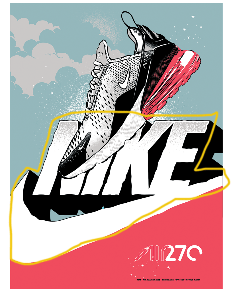
There are various uses of proximity in the design but personally I distinctly noticed the one in the middle above the others. This logo (the Nike swoosh below the spelled out word “Nike”) was one of the first logos used by Nike. After a while the “swoosh” became all that they needed to trigger brand recognition and the word was dropped. This design is using the proximity of the word and the symbol to trigger a sense of nostalgia and highlight the vintage nature of the Nike Air brand. In our day, older brands are trendy and the designer is using that to sell the shoe. Even though that logo isn’t found anywhere on the shoe, it’s being used in the design for brand recognition.
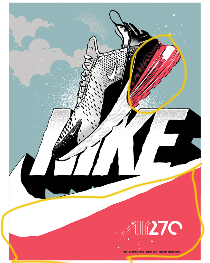
The use of color in this design is very intentional. The shoe that is being marketed is for casual use and in no way is meant for athletic usage. The feminine dark pink color used here is meant to target the surging market of females wearing athletic looking gear casually. This shoe is not meant for just women but the color suggests that the target market for this kind of shoe is particularly female.
Overall, I thought the designer used the principles of design very well to effectively sell the new Nike Air Max 270. The overall themes that I noticed were the use of color to create focus for the target market and to accentuate the most distinguishable part of the shoe that make it different from other shoes on the market. The other theme that was apparent was the use of the Nike Air brand equity to create a sense of vintage nostalgia for everyone who knows and adores the old Nike Air brand.
This is an example post, originally published as part of Blogging University. Enroll in one of our ten programs, and start your blog right.
You’re going to publish a post today. Don’t worry about how your blog looks. Don’t worry if you haven’t given it a name yet, or you’re feeling overwhelmed. Just click the “New Post” button, and tell us why you’re here.
Why do this?
The post can be short or long, a personal intro to your life or a bloggy mission statement, a manifesto for the future or a simple outline of your the types of things you hope to publish.
To help you get started, here are a few questions:
You’re not locked into any of this; one of the wonderful things about blogs is how they constantly evolve as we learn, grow, and interact with one another — but it’s good to know where and why you started, and articulating your goals may just give you a few other post ideas.
Can’t think how to get started? Just write the first thing that pops into your head. Anne Lamott, author of a book on writing we love, says that you need to give yourself permission to write a “crappy first draft”. Anne makes a great point — just start writing, and worry about editing it later.
When you’re ready to publish, give your post three to five tags that describe your blog’s focus — writing, photography, fiction, parenting, food, cars, movies, sports, whatever. These tags will help others who care about your topics find you in the Reader. Make sure one of the tags is “zerotohero,” so other new bloggers can find you, too.
